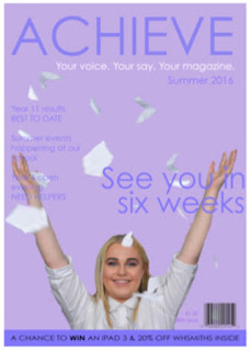
When reevaluating my preliminary task and using it as my basis of improvement for my main task I have done my outright best to completely change the layout. Personally, I thought my school magazine was dreadful so did not want my music magazine to consist of the same outcome. I did use it as a basis however for the conventions I used on my music magazine - for example: the tagline "Your voice. Your say. Your magazine" for the school one was very similar to the music one being "Your music. Your style. Your magazine" I thought that it was quick, snappy and rememberable meaning that the audience would be able to link this saying with the brand of magazines. Therefore, wanted to have a similar effect for my main task as it gave the magazine a more personal feel to it.

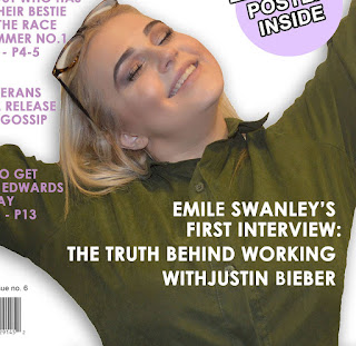
 The editing of the key image was much easier on the second attempt due to being now used to the format of "Photoshop" by completing the editing for the preliminary task. My first attempt was not at professional standard due to being new to the programme and not having the hang of things therefore the edges looked rough etc. Whereas, in my final product I believe the outcome was much more positive due to looking neat, more professional - this could be down to both the understanding of the editing programme of the amount of time I actually had on this product. I was also able to put a shadow around the key image which located the focus more for the audience. It gave the feel that the artiste was more out of the page in order to be more involved with the audience - the empathis of the image allows the focus to be on the happiness radiating from the image. I got my idea for the key image in the main task from the preliminary as they are both quite similar - I wanted to involve arms in both image as it isn't something you see on every magazine and also portrays more emotion through body language as well as the facial expression.
 In the preliminary, I remember thinking that it would need a background colour to look more professional and engaging for the audience - whereas, in the full product I stayed with a white background and let the rest of the colour spectrum stand out on the page more - it gave it vibrance on the page. For example, the masthead isn't as bold as the preliminary because it has no reason to be, the use of colour allows it to stand out more and gain the recognition it needs - it is also achieving this from the use of the black colouring directly underneath the masthead because the contrast of colour gives it definition. Whereas, in the preliminary the different tones of the same base colour does not stand out as much as it should. Overall, I used the colouring from the preliminary as I thought it would suit my target demographic perfectly.
Both drafts of my final product contain the same conventions in which my preliminary product did. My first attempt (the one to the left) was the wrong colouring and didn't offer the professional feel as much as the second attempt did. Also, I felt it did not represent my target demographic enough and the key image was not edited further like it is in my final product so does not contain as much of an empathis.
Overall, from my front cover of my preliminary task I can honestly say I gained a lot of adapted ideas in which I used in my final product. It gave me both the confidence and knowledge I needed to know to gain a happy result in my magazine.
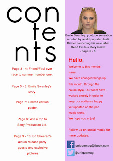
 The outcome of the contents page for my preliminary task was tragic - I had an idea in mind but did not have a clue on how to consume it and this was both down to the fault of my own, the lack of knowledge of the programme and the timing I had to create the contents page. However, it does in fact include many features that I have also used for my final product. In this page (to the left) I included a note from the editor in which I really liked so I therefore carried through to my final product. I thought it gave the magazine a more 'personal feel' and allowed the audience to become more in contact with the person behind the magazine. Moreover, I did not like the way it was presented in the preliminary task and much preferred my final product outcome. Each piece of typography was sleek but also representative of my target audience. The message was shorter but more effective and it overall looked more professional.
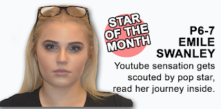
 My final product's contents page contained a section solely for the main story of the magazine whereas my preliminary task didn't. I in fact gained this idea from a previous music magazine and thought it looked very ideal for my magazine, Quirk. The key image, again, looks much more professional than it did in the preliminary task as I had gained the understanding on how to use the tools etc. Again, I used a drop shadow around the image in order for it to stand out completely from the page. Also, I used the tools on the programme to create a "puff" within the contents page (the 'star of the month') sign which allows the audience to understand she is new and upcoming but also to recognise the main feature of the magazine. The pink relates back to the colour of the DPS to carry out the house-style throughout - I did in fact have a continuous house-style in my preliminary task so I gained that knowledge from this. The images from my preliminary was taken from an iPhone camera whereas the final product images were taken from a DSLR camera which would instantly give it a more professional capture anyway. I learnt that the iPhone camera was not a good idea if you wanted to have this overall feel for the image as it does not allow the right exposure to the image.

Similar to my front page, I in fact constructed two drafts of my final product's contents page. Which, like my front cover I didn't like the first design (the one to the left) - it didn't fit my target demographic, my house style or look professional. I kept the key image the same however edited it more on the second draft, the idea of the editor's note was also the same but again generated a better outcome. The typography is very similar due to liking the 'bubble' look for my magazine as it fit the criteria for both the overall look for my magazine and the target demographic I wanted to achieve.
Overall, the contents page includes the same conventions for both the preliminary task and the final product. Each one however, is constructed in a completely different way but from the failure of my first attempt I learnt how I really wanted my final task to pan out.
Each aspect of my preliminary task allowed me to gain the knowledge of the key features and conventions of a magazine by both the research and construction behind it. It taught me that I had to be patient otherwise the outcome will look rushed and therefore lead to an unprofessional result and me to therefore be unhappy with the product. This task as a whole, has allowed me to use software such as Photoshop, Prezi etc. which I wasn't comfortable using before - meaning, it has widened my editing an analysation skills. Also, it has brung me out of my comfort zone by actually completing both a voiceover and a video based answer for my evaluation which I would initially never of done. Finally, the preliminary task taught me to concentrate and focus on the final outcome I wanted from my product and I personally feel that I have achieved it through the magazine I have created through, Quirk.


