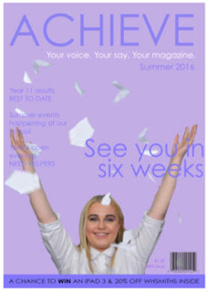
From my front cover, I think it is quick to portray that the target audience is for young teens/ early twenty females from the colour scheme, typography and star appeal used. Moreover, from the niche 'pop' music magazine the specific social group can be assumed to be within the grade D & E working groups (both low grade workers and within education).
Star appeal is used through both the new upcoming music artiste but also through the mentioning of "Justin Bieber". Emile Stanley's star appeal would attract the "aspirers" and "explorers" lifestyle groupings due to her story of how she has been recognised so the audience would want to be like her and therefore use her as a role model. Whereas, Justin Bieber's star appeal would attract people from the "mainstreamers" lifestyle group due to his mass following and success story and they would then be able to recognise this to be a 'pop' music magazine, as a whole. From his mass following the social groups he is carrying would generate a wide audience for this particular magazine therefore star appeal on this behalf would determine success.
The tagline "Your music. Your style. Your magazine" allows the magazine to be personal to each member of its demographic which younger audiences would find special and therefore be a part of the magazine itself therefore relating back to the D and E social groups.
The contents page carries the house style from the front cover therefore generating the same social groups etc.
The colouring is still similar, a very female based pallet - the letter from the editor continues the lilac theme so the audience can relate back to the front cover. The "star of the month" uses a light pink colour as this is the sole base colouring of the DPS so again, a link can be made. The rest of the colours are from the pastel spectrum to continue the "pureness" that the magazine withholds.
The star appeal is using direct address in the key image of the contents, therefore involving the audience - letting them into her life; I did this for the contents page due to the enigma it creates where the demographic need to find out more about her and what her story withholds, keeping everyone intrigued.
The magazine also has a very feminine typography running through it - the bubbly font in each title connotes a happy persona around the magazine.

In the DPS social groups are shown by many features. Firstly, the use of the social media links at the bottom of the page promotes both groups due to the modernisation in technology being a dominant platform in this society so it shows the magazine is up to date with this term and can provide text for both the physical and social users.
The three polaroid images promotes the social groups too due to being used by the younger ages in recent times so again, using modernisation in the magazine.
The pink is a clear representation of the target audience being females as this is the connotation of the colour. Also, it has the connotations of love and peace which the story promotes as well - the natural elements are issued through the new artiste so the colour is parallel to this.
Overall, each element to my magazine has both on going and singular themes in which represent specific social groups which are from both the D and E lifestyle group but also elements of "aspirers" "explorers" and "mainstreamers" hinted at throughout.


No comments:
Post a Comment