Tuesday, 20 December 2016

Evaluation

Overall, I really enjoyed this task due to it gave me a warm for editing magazines which is good for both the main task and my future career – due to, desiring to be a journalist so one day could go down the magazine industry. It has helped me to recognize and understand what people want to find in a magazine and the thought process behind constructing a magazine. Each derail has to be relevant, effective and comforting for the target audience.

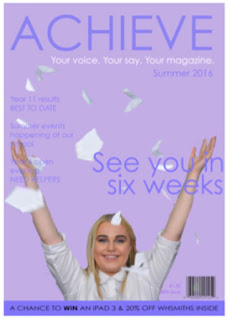
As soon as I heard the task, I constructed my idea for the front cover key image and decided what I wanted my magazine to look like. When visualizing my idea, I didn’t think that it would have been that much of a challenge to create it. However, this was not the case. When constructing the key image, it took longer than I thought due to the fact the paper wasn’t falling like I wanted it too. The paper needed to look like it was floating like it had just been thrown up in the air because it is then like the traditional end of school, bell ringing theme. Eventually, I gained the image I wanted but with less pieces of paper, which I then copied and pasted, some of the other pieces from the other pictures and morphed them into the image I decided to use for the final image.

The house style for the magazine was easy to come up with, as I wanted to keep it sweet and simple to then attract the target audience. The simpleness from the magazine is then easy to read which younger children will then want to read what the magazine has to offer. Purple, is also a very middle colour that can be used for both girls and boys and will attract both.

The contents page went wrong. The idea I had in my mind didn’t work out, at all but I was resilient and tried multiple times in order to get it right but unfortunately, still didn’t work out. Therefore, I decided to add all of the features to the magazine but used it as a learning mechanism instead using it to learn not what I should do and build a contents page that I know I will thoroughly like.

To conclude, the challenge was fun to complete and it allowed me to prepare for the main task and except the problems I could face on the way.

Monday, 19 December 2016

Contents Page & Analysation

Unfortunately, my contents page did not go to plan. I had an image in my mind but it did not turn out the way I wanted it too - I could lead this to the fault of both: not very confident in the software I used and the timing I had in actually composing the magazine, if I had much longer in order to get used to the software and use precision on the design then it would result in being much better and more professional. I did restart this task, multiple times and still could not gain a great result therefore thought I would leave it and use it as a learning mechanism for my final design in my main task of what not to do. My contents page does still contain the key elements from the previous magazines I deconstructed. 

Friday, 9 December 2016

Front Cover & Analysation

The front cover I intended to keep 'simple and sweet' due to the target audience being Secondary School children and their parents therefore they wouldn't want to consume something 'too over the top' due to my wanting for it to be a 'light read' so nothing too challenging. The parents would also consider it as a 'safe theme' meaning that they would then feel comfortable with their children interacting with the text. Personally, I like the house style, the colour scheme is neutral therefore unisex and the typography is sleek and matching throughout. The strap line withholds a competition that would engage the demographic therefore a selling point for the magazine. Key conventions in the magazine, include: key image, barcode, price, issue number, masthead, anchorage text, tag line, sell lines etc. The area I would critique, is the cropping of the key image didn't go to plan - as it was my first time using 'Photoshop' I wasn't confident in all of the tools and therefore gained this result which I am not truly happy with. I did try to change it, multiple times however could not conclude in smooth edges. 

Key Image (front cover) Ideas


Tuesday, 6 December 2016

Questionnaire & Results

I created a questionnaire in order to gain evidence and guidance on how I am going to construct my magazine due to then having results in which the demographic prefer to see in a magazine. I gave the questionnaires out around the school in order to gain various numbers from different age categories. Here are the results I collected:
  • 100% of the people buying a school magazine would only purchase once a month. 
  • The majority of the target audience would want to receive tips within the magazine - whether that being homework tips/ revision tips (for example).
  • 80% of the people ticked both categories and requested for a magazine for both the parents and the students of the school to be combined. 
  • 8 out of every 10 people are likely to buy a school magazine. 

Question 7: Looking back at your preliminary task, what do you feel you have learnt in the progression from it to the full product?

When reevaluating my preliminary task and using it as my basis of improvement for my main task I have done my outright best to completel...