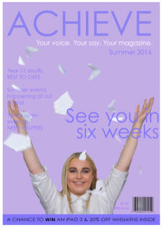
The front cover I intended to keep 'simple and sweet' due to the target audience being Secondary School children and their parents therefore they wouldn't want to consume something 'too over the top' due to my wanting for it to be a 'light read' so nothing too challenging. The parents would also consider it as a 'safe theme' meaning that they would then feel comfortable with their children interacting with the text. Personally, I like the house style, the colour scheme is neutral therefore unisex and the typography is sleek and matching throughout. The strap line withholds a competition that would engage the demographic therefore a selling point for the magazine. Key conventions in the magazine, include: key image, barcode, price, issue number, masthead, anchorage text, tag line, sell lines etc. The area I would critique, is the cropping of the key image didn't go to plan - as it was my first time using 'Photoshop' I wasn't confident in all of the tools and therefore gained this result which I am not truly happy with. I did try to change it, multiple times however could not conclude in smooth edges.
Subscribe to:
Post Comments (Atom)
Question 7: Looking back at your preliminary task, what do you feel you have learnt in the progression from it to the full product?
When reevaluating my preliminary task and using it as my basis of improvement for my main task I have done my outright best to completel...

-
From my front cover, I think it is quick to portray that the target audience is for young teens/ early twenty females from the colour s...
-
When reevaluating my preliminary task and using it as my basis of improvement for my main task I have done my outright best to completel...
-
The next uploads are a part of my evaluation. Looking back on what I have achieved, how I achieved it and what my original intentions w...


No comments:
Post a Comment